Melbourne isn’t just a city; it’s a UNESCO City of Literature.
For our authors and publishers, that title carries a certain weight, setting a high bar for the quality of book printing in Melbourne.
In a market where readers frequent the independent bookstores of Brunswick or the high-end boutiques in the CBD, a book’s physical presence is its first—and often only—pitch.
While the manuscript is the heart of the project, the ‘hand-feel’ is what closes the sale.
Whether it’s the choice of a matte laminate or the specific GSM of the internal pages, print quality isn’t a finishing touch; it’s a core business strategy.
The Five-Second Test: Why Readers Do Judge a Book by Its Cover
Walk into any boutique bookstore in Fitzroy or the CBD, and you’ll see the same behavior: a reader stops, looks at a spine, pulls a book out, and immediately runs their thumb over the cover.
This is the “Five-Second Test,” and it’s where your sale is won or lost.
In retail, books compete in two dimensions: visual and tactile.
A book that features a crisp, high-resolution cover with vibrant color fidelity tells the reader that the content inside is equally polished.
It’s a silent signal of trustworthiness.
On the other hand, if a reader picks up a book and feels thin, “see-through” paper or sees a spine that’s already beginning to crease, the perceived value of the work drops instantly.
Even the most compelling manuscript can’t fully overcome the “amateur” tag that comes with poor production.
Consumer psychology in the Melbourne market shows a strong preference for “object-hood”—the idea that a book is a physical artifact.
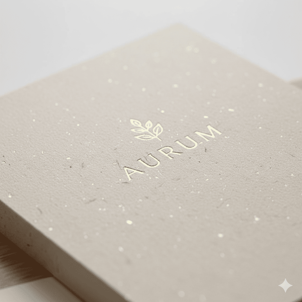
Features like embossed lettering, spot UV highlights, or a velvet-touch laminate don’t just make a book look premium; they allow you to command a higher price point.
When a book feels like a collectible, it stops being a disposable purchase and starts being an investment.

The Anatomy of the Reading Experience: Comfort vs. Friction
A book is more than a container for a story; it is an interface.
Just as a slow-loading website frustrates a user, a poorly printed book creates “friction” that pulls the reader out of the narrative.
When you prioritize high-quality book printing in Melbourne, you are essentially investing in a better user experience for your audience.
Here is how the physical specs translate to reader satisfaction:
Paper Opacity & The “Ghosting” Effect: There is nothing more distracting than seeing the text from page 12 “bleeding” through while you’re trying to read page 11.
Using a higher-opacity stock (like a premium 90 GSM cream bookwove) eliminates this “ghosting,” allowing for a clean, immersive reading experience—especially important for long-form fiction.
Ink Legibility & Eye Strain: Cheap digital printing can often result in “greyed-out” text or fuzzy edges.
Professional-grade ink fidelity ensures high contrast and crisp font clarity.
This reduces eye strain, which is crucial for readers who might be spending hours with your book in a dimly lit Carlton café or on a late-night commute.
The “Lay-Flat” Factor: We’ve all struggled with a book that “fights back”—one that requires two hands to keep open because the binding is too stiff.
Using PUR binding or section sewing allows the book to lay flatter, making the act of reading feel effortless rather than a workout for your thumbs.
Tactile Longevity: A book is a souvenir of an experience.
If the spine cracks or pages begin to yellow after one summer, it signals to the reader that the work is “disposable.”
Sturdy, acid-free paper and modern adhesives signal that your brand stands for quality and longevity.
Brand Equity: When the Object Becomes the Advertisement
In the world of publishing, your book is your most permanent business card.
Whether you are an independent author or a corporate brand, the physical quality of your title dictates how the market perceives your authority. In a sophisticated literary market, “good enough” printing is often a brand-killer.
Here is how print quality translates into market positioning:
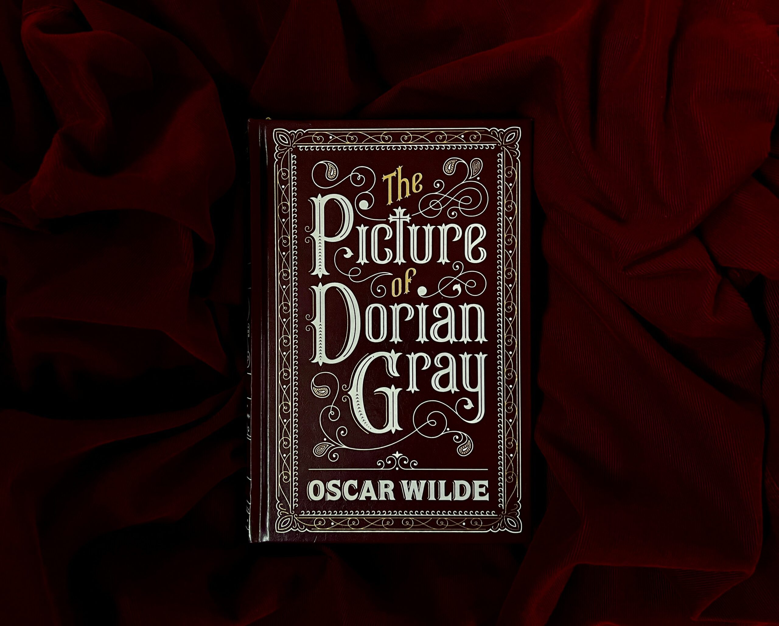
The “Prestige” Signal: High-end production—think heavy-weight stock, debossed covers, or linen textures—signals that the content inside is valuable.
When a book feels heavy and looks meticulously crafted, it justifies a “premium” price tag.
If you’re aiming for the gift market or high-end retail in the CBD, these tactile details are what move a book from the “maybe” pile to the “must-have” list.
The Collectibility Factor: We are seeing a massive shift toward “Books as Decor.”
By using specialty techniques like foil stamping or stenciled edges, you turn a simple read into a collectible object.
This is a strategic move for niche publishers: you aren’t just selling information; you’re selling a status item that readers want to display on their shelves in a Fitzroy loft or a suburban study.
Trust and Consistency: If you are building a series, consistency is your best friend.
If Volume 1 has a sturdy PUR binding and Volume 2 uses a cheaper adhesive that cracks, you’ve broken the “brand promise.”
Loyal readers—the kind who shop at Hill of Content or Avenue Bookstore—notice these discrepancies.
Consistency across your titles builds a “visual language” for your brand that makes your next release an automatic purchase for your fans.
The Cost of “Budget” Printing: Low-quality printing doesn’t just look cheap; it erodes your credibility.
If the cover curls (the dreaded “cover flare”) or the ink smudges under a thumb, the reader subconsciously questions the accuracy of the information inside.
In a professional landscape, poor print quality isn’t a “saving”—it’s a liability to your brand equity.

Pro-Grade Specifications: A Quick-Guide for Publishers
If you are working with a commercial printer, these are the industry-standard “specs” that separate professional titles from amateur projects.
| Book Type | Recommended Paper (Internal) | Recommended Binding | Popular Finish (2026 Trends) |
| Fiction / Novels | 80–90 GSM Bookwove (Cream) | PUR Perfect Bound | Matte Laminate + Spot UV Title |
| Memoirs / Non-Fiction | 100 GSM Opaque White | PUR Perfect Bound | “Soft Touch” Scuff-Resistant Matte |
| Children’s Books | 130–150 GSM Satin Coated | Saddle Stitch or Burst Bound | High-Gloss Laminate (Wipe-clean) |
| Coffee Table / Art | 150–170 GSM Gloss/Silk | Case Bound (Hardcover) | Gold Foil Stamping + Dust Jacket |
| Special Editions | 100 GSM Premium Recycled | Section Sewn | Sprayed or Stencilled Edges |
Case Studies: When Print Quality Becomes the “Silent Salesman”
In the current market, we are seeing a shift toward “Books as Objects.”
In a city like Melbourne, where a book isn’t just a read but a lifestyle statement, these real-world examples show how production choices directly drive revenue.
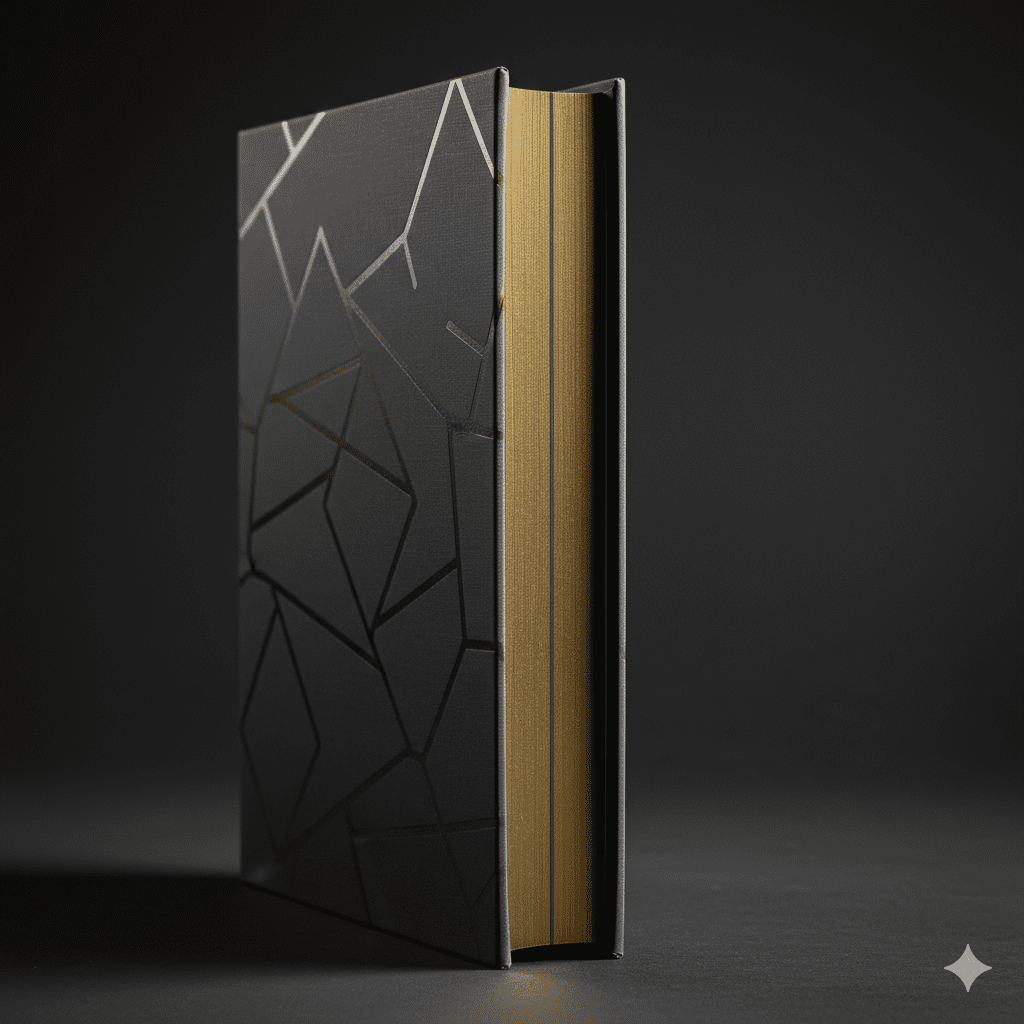
1. The Coffee Table Evolution: “Minimalist Luxury”
The 2026 trend for high-end art and coffee table books has moved toward Minimalist Hardcovers.
Instead of busy, loud dust jackets, successful publishers are opting for linen-wrapped boards with deep debossing or foil stamping.
The Result: By choosing a 150 GSM FSC-certified silk paper and premium case binding, these books are positioned as interior decor.
This allows local galleries and boutiques in South Yarra or the CBD to retail them at $80–$120+, far exceeding the price point of a standard digital print.

2. Children’s Books: The “Sensory Safety” Standard
For the “Early Reader” market, durability is a safety requirement. Parents shopping at local spots like The Little Bookroom look for books that can survive a toddler.
The Result: Publishers who specify 150-170 GSM thick silk paper with rounded corners and non-toxic soy-based inks see significantly lower return rates.
In 2026, “Safety-Certified” printing isn’t just a hurdle; it’s a marketing badge that builds immediate trust with educators and parents.
3. The Indie “Special Edition” Boom
We’ve seen a massive surge in Melbourne’s self-publishing scene using Special Edition features—like sprayed edges or hidden cover art—to drive pre-orders.
The Result: Indie authors who invest in professional-grade “Shelf-Parity” (making their book indistinguishable from a Penguin Random House title) are the ones landing deals with independent bookstores in Brunswick and Northcote.
When a self-published book has a high-quality PUR binding and a “soft-touch” laminate, it removes the “amateur” barrier, allowing it to compete for premium shelf space.
The Bottom Line
These cases prove a simple truth: print quality isn’t an expense—it’s your most effective marketing tool.
In a world of digital “slop,” a beautifully produced physical book is an experience that readers are willing to pay a premium for.
The 2026 Tech Toolkit: Precision Meets Efficiency
In the past, authors had to choose between “fast and cheap” or “slow and premium.”
Modern advances in book printing in Melbourne have blurred these lines.
Today, the technology you choose is less about compromise and more about matching your specific business model.
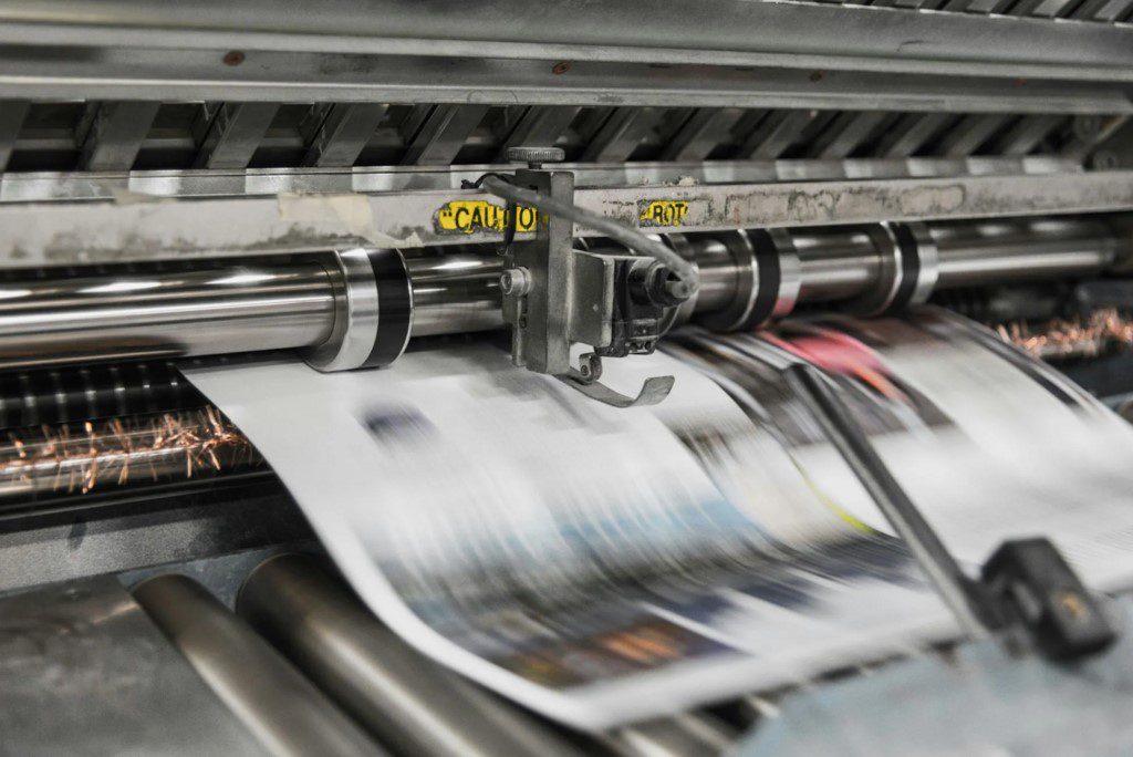
1. Digital Printing: The King of Agility
Digital printing is no longer the “budget” backup. In 2026, high-speed inkjet and toner technologies (like the HP Indigo or Canon series) deliver color fidelity that rivals traditional methods.
The Strategy: This is the go-to for Print-on-Demand (POD) and small “test” runs of 50–500 or even 5000 copies.
It allows for Variable Data Printing (VDP), meaning you can personalize individual copies or create limited-run “Melbourne-only” editions without the heavy setup costs of plates.
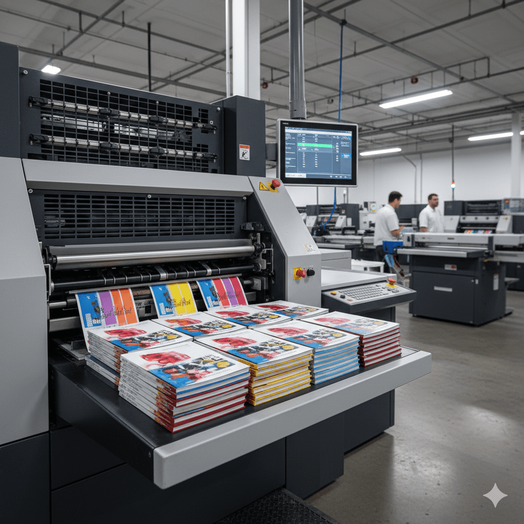
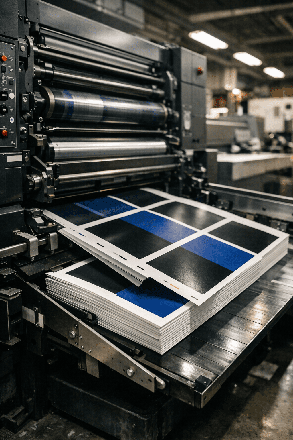
2. Offset Printing: The Gold Standard for Scale
For print runs exceeding 5000 units, Offset Lithography remains the undisputed heavyweight for unit-cost efficiency and crispness.
The Strategy: Use offset for your primary retail launch.
It handles “solid” colors (like a deep navy or black cover) with a smoothness that digital can’t quite match.
Additionally, laminated finishes and specialty adhesives bond more effectively to offset inks, making it the better choice for books intended to last decades.
3. Hybrid Printing: The Best of Both Worlds
A major 2026 trend is Hybrid Production, where the “static” parts of a book (the text) are printed via offset to save costs, while the covers or special inserts are handled digitally to allow for customization.
This provides the “premium” feel of a big-house publisher with the flexibility of an indie press.
4. Finishing Tech: The Tactile Edge
To stand out on the shelves of a busy Brunswick bookshop, you need to engage the reader’s sense of touch.
Spot UV & Sleeking™: Digital “sleeking” has replaced traditional spot UV for many, allowing for 3D raised gloss effects that catch the light without the need for expensive custom dies.
Sustainable Foiling: In 2026, we’ve moved toward transfer foils that are fully recyclable.
You can now get that “gold-leaf” luxury look on a Melbourne-printed book while maintaining your eco-friendly brand credentials.
Why Tech Choice is a Business Choice
Selecting the right method ensures you aren’t overpaying for inventory you don’t need (via Digital/POD) while ensuring your large-scale retail releases (via Offset) have the lowest possible per-unit cost.
By partnering with a printer that offers both, you can scale your production as your book gains momentum.
Cost Considerations and the 2026 ROI
It is a common misconception that high-quality printing is an “optional luxury.”
In reality, the decision between budget and premium printing is a calculation of Return on Investment (ROI).
While the upfront cost of superior materials—like FSC-certified 90 GSM stock or PUR binding—is higher, the long-term financial benefits are measurable.
Commanding a Premium Price: A “Special Edition” with minimalist hardcover design and foil stamping can often retail for 30–50% more than a standard paperback.
In the Melbourne market, where readers value “books as objects,” this aesthetic upgrade pays for itself within the first few hundred copies.
The Shipping & Returns Trap: Cheaply bound books are prone to damage during transit, especially with the rising costs of freight across Australia.
Every cracked spine or scuffed cover is a lost sale and a costly return.
Investing in durable binding and scuff-resistant laminates reduces these “hidden costs” significantly.
The Direct-to-Consumer (D2C) Advantage: More Melbourne authors are selling directly via Shopify or social media.
When you sell D2C, you keep the full margin.
A high-quality physical product ensures that the “unboxing experience” leads to the social media shares and five-star reviews that drive organic growth.

Conclusion: The New Standard of Excellence
In the competitive landscape of 2026, content is only half the battle.
Your print quality is the physical manifestation of your brand’s authority.
From the tactile “snap” of a well-bound spine to the zero-ghosting clarity of premium paper, every technical detail is a silent conversation with your reader.
For publishers, authors, and commercial printers, the goal is no longer just “mass production.”
It is about crafting an immersive experience that respects the reader’s time and investment.
In a city like Melbourne, where literature is part of the cultural DNA, quality isn’t just a differentiator—it’s the price of entry.